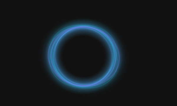
CSS3霓虹灯文字动画特效

这是一个完全由CSS3实现的霓虹灯文字动画特效,虽然看起来有flash的质感和js驱动的错觉,但事实上你可以看到所有代码如下:
<!DOCTYPE html>
<html>
	<head>
		<meta charset="UTF-8">
		<title>CSS3霓虹灯文字特效</title>
		<style>
.text-effect {
  overflow: hidden;
  position: relative;
  -webkit-filter: contrast(110%) brightness(190%);
          filter: contrast(110%) brightness(190%);
}

.neon {
  position: relative;
  background: black;
  color: transparent;
}
.neon::before, .neon::after {
  content: attr(data-text);
  color: white;
  -webkit-filter: blur(0.02em);
          filter: blur(0.02em);
  position: absolute;
  top: 0;
  left: 0;
  pointer-events: none;
}
.neon::after {
  mix-blend-mode: difference;
}

.gradient,
.spotlight {
  position: absolute;
  top: 0;
  left: 0;
  bottom: 0;
  right: 0;
  pointer-events: none;
  z-index: 10;
}

.gradient {
  background: -webkit-linear-gradient(45deg, red, blue);
  background: linear-gradient(45deg, red, blue);
  mix-blend-mode: multiply;
}

.spotlight {
  -webkit-animation: light 5s infinite linear;
          animation: light 5s infinite linear;
  background: -webkit-radial-gradient(circle, #ffffff, rgba(0, 0, 0, 0) 25%) 0 0/25% 25%, -webkit-radial-gradient(circle, #ffffff, #000000 25%) 50% 50%/12.5% 12.5%;
  background: radial-gradient(circle, #ffffff, rgba(0, 0, 0, 0) 25%) 0 0/25% 25%, radial-gradient(circle, #ffffff, #000000 25%) 50% 50%/12.5% 12.5%;
  top: -100%;
  left: -100%;
  mix-blend-mode: color-dodge;
}

@-webkit-keyframes light {
  100% {
    -webkit-transform: translate3d(50%, 50%, 0);
            transform: translate3d(50%, 50%, 0);
  }
}

@keyframes light {
  100% {
    -webkit-transform: translate3d(50%, 50%, 0);
            transform: translate3d(50%, 50%, 0);
  }
}
.neon {
  font: 700 220px 'Lato', sans-serif;
  text-transform: uppercase;
  text-align: center;
  margin: 0;
}
.neon:focus {
  outline: none;
  border: 1px dotted white;
}

body {
  background: black;
  display: -webkit-box;
  display: -ms-flexbox;
  display: flex;
  min-height: 100vh;
  -webkit-box-pack: center;
      -ms-flex-pack: center;
          justify-content: center;
  -ms-flex-line-pack: center;
      align-content: center;
  -webkit-box-align: center;
      -ms-flex-align: center;
          align-items: center;
}
		</style>
	</head>
	<body>
		<div class="text-effect">
			<!-- Select the text in the preview and type in your own -->
			<h1 class="neon" data-text="SHUWON" contenteditable>SHUWON</h1>
			<div class="gradient"></div>
			<div class="spotlight"></div>
		</div>
	</body>
</html>