纯CSS3代码制作仿真开关
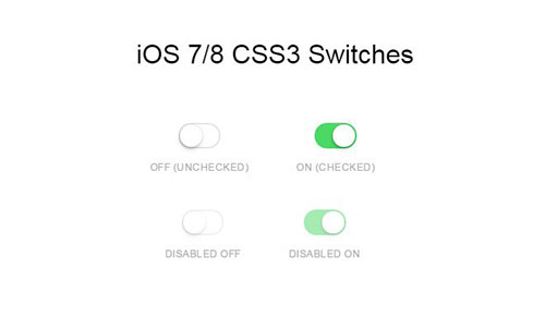
纯CSS3代码制作仿真开关全部代码,模仿的即是这张GIF图片,是不是很逼真呢?

<!DOCTYPE HTML>
<html>
<head>
<meta http-equiv="Content-Type" content="text/html; charset=gb2312" />
<title>纯CSS3代码制作仿真开关</title>
<style type="text/css">
body {
background: #444444;
}

.switch input {
  top: 0;
  right: 0;
  bottom: 0;
  left: 0;
  -ms-filter:"progid:DXImageTransform.Microsoft.Alpha(Opacity=0)";
  filter: alpha(opacity=0);
  -moz-opacity: 0;
  opacity: 0;
  z-index: 100;
  position: absolute;
  width: 100%;
  height: 100%;
  cursor: pointer;
}

.switch {
	width: 180px;
	height: 55px;
	position: relative;
	margin: 100px auto;
}

.switch label {
	display: block;
	width: 80%;
	height: 100%;
	position: relative;
	background: #1F2736; /*#121823*/
    background: linear-gradient(#121823, #161d2b);
	border-radius: 30px 30px 30px 30px;
	box-shadow:
        inset 0 3px 8px 1px rgba(0,0,0,0.5),
        inset 0 1px 0 rgba(0,0,0,0.5),
        0 1px 0 rgba(255,255,255,0.2);
		-webkit-transition: all .5s ease;
transition: all .5s ease;

}

.switch input ~ label i {
    display: block;
    height: 51px;
    width: 51px;
    position: absolute;
    left: 2px;
    top: 2px;
    z-index: 2;
    border-radius: inherit;
    background: #283446; /* Fallback */
    background: linear-gradient(#36455b, #283446);
    box-shadow:
        inset 0 1px 0 rgba(255,255,255,0.2),
        0 0 8px rgba(0,0,0,0.3),
        0 12px 12px rgba(0,0,0,0.4);
	-webkit-transition: all .5s ease;
transition: all .5s ease;
}


.switch label + span {
	content: "";
	display: inline-block;
	position: absolute;
	right: 0px;
	top: 17px;
	width: 18px;
	height: 18px;
	border-radius: 10px;
	background: #283446;
background: gradient-gradient(#36455b, #283446);
box-shadow:
		  inset 0 1px 0 rgba(0,0,0,0.2),
  		0 1px 0 rgba(255,255,255,0.1),
  		0 0 10px rgba(185,231,253,0),
  inset 0 0 8px rgba(0,0,0,0.9),
  inset 0 -2px 5px rgba(0,0,0,0.3),
  inset 0 -5px 5px rgba(0,0,0,0.5);
 	-webkit-transition: all .5s ease;
	transition: all .5s ease;
	z-index: 2;
}

 /* Toggle */
.switch input:checked ~ label + span {
	content: "";
	display: inline-block;
	position: absolute;
	width: 18px;
	height: 18px;
	border-radius: 10px;
	-webkit-transition: all .5s ease;
	transition: all .5s ease;
	z-index: 2;
	background: #b9f3fe;
background: gradient-gradient(#ffffff, #77a1b9);
box-shadow:
		  inset 0 1px 0 rgba(0,0,0,0.1),
		  0 1px 0 rgba(255,255,255,0.1),
		  0 0 10px rgba(100,231,253,1),
		  inset 0 0 8px rgba( 61,157,247,0.8),
  inset 0 -2px 5px rgba(185,231,253,0.3),
  inset 0 -3px 8px rgba(185,231,253,0.5);

 }

.switch input:checked ~ label i {
    left: auto;
    left: 63%;
	box-shadow:
        inset 0 1px 0 rgba(255,255,255,0.2),
        0 0 8px rgba(0,0,0,0.3),
        0 8px 8px rgba(0,0,0,0.3),
		inset -1px 0 1px #b9f3fe;

	-webkit-transition: all .5s ease;
transition: all .5s ease;
}


</style>
</head>
<body>
<div class="switch">
	<input type="checkbox" name="toggle">
	<label for="toggle"><i></i></label>
	<span></span>
</div>
</body>
</html>